Monday

GOLDEN RULES


Golden Rules:


1. EVERY ROOM NEEDS GOLD. 
Nothing can replicate the warm glow of gold. We used a gold leather poof and a golden mirror to warm this contemporary beach house. Add gold to any space to add warmth.  Every space needs something Gold.
2. MIX METALS. 
It doesn't mater if your appliances are stainless steel or your fixtures are polished nickel. Mixing metals adds sophistication to any space. Try it. This room has an eclectic mis of furnishings and elegantly mixes golden stools with polished chrome chair bases and a aged bronze chandeleir. The key is reapeat each element about three times throughout the room.

3. GOLD IS MODERN. 
It is essential to use gold elements in modern design. Paired with the clean lines of these styles- gold offers much needed warmth and sophistication. This chandelier from Errez Design Shop makes the room.
4. GOLD & CLEAN 

For a fresh approach to gold- keep the lines clean. Stay away from excessive ornamentation and filigree. Let the material speak for itself. This stool from Errez Design Shop is clean , simple and elegant. 


5. BOLD GOLD. 

Don't be afraid to go bold. This room is wallpapered in golden wallpaper. It's dramatic and fabulous. For a high style show stopping room go bold!

Friday

Why don’t you have a golden pineapple in your fruit tray?
Add some luxe to your life


I burst out laughing when I opened my fridge and found a stuffed animal sitting on top of the egg carton. Whenever my mom has been over I know to expect that before she leaves she’ll put something funny or glamorous somewhere that will make me smile. Her mom used to do that for her to - a sort of family tradition of leaving smiles for each other. 

As a designer, It makes me wonder why we don’t do this for ourselves? Why don’t we put glamorous objects in everyday places? Why isn’t it normal to open our fridge or medicine cabinet and see a single daisy smiling back at  us?

Most people rate happiness as their highest importance in life. That’s because happiness doesn’t just feel good; it’s good for you. It’s scientifically proven that your environment effects the way you feel. 

So why not put glamorous, funny or special things in every day places that will make us smile on a daily basis? 

Try putting pearls around the neck of your soap dish, put a colorful garden stool in your shower, put a bud vase in your medicine cabinet, hang a framed painting in your garage, or wallpaper the ceiling in your closet. Why not start with putting a golden pineapple in your fruit bowl. 


Check out this one from Errez DESIGN SHOP: http://www.errezdesignshop.com/#!/ACCESSORIES

Tuesday

Boca Raton Progress.

Here is a sneek peek at a project that is very near completion in Boca Raton. This house is filled with natural textures, worldly patterns, and earthy colors. We love the way its coming together. We'll have more pictures soon.


This might be the most amazing cabana bathroom. It is bursting with color and personality. We love the dramatic Moroccan inspired wallpaper, the modern lights, and luxurious blue mirror.


Friday

DREAM BEACH HOUSE

It's great to design somebody's primary residence, however, it's really fun to design a vacation home. A vacation hone can be designed artistically and boldly. Take risks with color, art, and furniture that you may not want to take with your first home. This vacation home that we designed a few years ago doesn't take itself too seriously. 

It starts at the entrance. This lime green bungalow 5 desk pops in this grey blue room. An antique pair of doors from Paris lean in front of the window and add texture and privacy to the space. A pair of disco ball inspired mirrored lamps set the scene for this party house. A cool Trina Turk rug, a Moroccan gold poof, a gold and bronze starburst mirror, and limited edition Bitossi ceramic accessories complete the look in this luxurious yet beachy foyer.

The dining room features a long antique wooden spanish table. The slip covered chairs are perfect for dining after a day of surfing. This room has a deep navy lacquered ceiling that makes the ceiling disappear. at night it feels like an outdoor courtyard.  

You can't have a beach house without coral patterned linen fabrics and  a collection of bright indoor/ outdoor pillows. A group of traditional Moroccan lanterns hang in the corner. 

This modern bathroom has a Moroccan inspired rug and antique indonesian mirror

When you have a beach house this cool all your friends will want to spend the night. We took this forgotten back room and turned it into a chic mini-guest room. Inspired by the beach, we drew a horizon line down the middle of the room. As a rule everything bellow the line is white, everything above the line is mink. This distracts from the narrowness of this tiny room. Prints from St. Barthes & Martinique line the back wall.

Bold stripes and dots and convex mirrors line the kids bathroom. 

The master bath is a bit more serene than the rest of the house but no less intense. Its layered with white surfaces and mirrors over mirrors. Layering the mirrors not only makes this bathroom more luxurious feeling it also gives the illusion that this space is larger than it really is.
The master bedroom is a luxurious and sexy retreat. Retro foiled wallpaper from cole and son and DVF leopard bedding add a ton of color to this room. The gilded night stands are an unexpected luxurious choice for a beach house. White trophy lamps add a bit of hollywood glam to this room.

No beach house is complete without a hot pink Bertoia chair and a Missoni pillow. 


The patio is washed in shades of grey. Allowing the landscape to be the star. Errez Design signature Cuban Tile wall adds a rich Old Havana texture to this layered beach house.

Hang the sandy surfboards in the dining room. Why not?


Thursday

DESIGNING FOR AN ART COLLECTION

THE GALLERY WALL
Many of our clients have amazing art collections. We love to let these collections drive the design of a room. A gallery wall is a good way to display a large growing art collection. Every house should have one gallery wall. Forget all the old rules of things needing to match or be similar sized. When displaying art collections the only important rule is that you like it enough to see it all the time. Remember collections are living breathing things. They change and evolve over time. Allow room to grow. Bellow are some ways that we've designed around collections:


Art from floor to ceiling

This gallery makes a tripe across the wall

This gallery unifies the odd window placement and vaulted ceiling of this room.

The more the merrier.

Display things like surfboards as art.

Black and white photography makes a chic gallery wall.

Incorporate game trophies.

Layer art for a rich look.

For a causal display lean art on the wall. 

Saturday

The White Kitchen

Check out the progress on this all white kitchen with a spectacular antique mirror hood!
Check out the progress on this all white kitchen with a spectacular antique mirror hood

Friday

Top 10 best IKEA products

So many people want to get the best bang for their money. Ikea is a good place to start. Be careful a house entirely assemble from Ikea is not ideal. Here is a list of ERREZ design approved IKEA products that you can confidently use is any high end design. All of these items are less than $300
STRANDMON $279

STOCKHOLM $299

MELLBY $249

COLDBY $199

PS 2012 $49

HEKTAR $69
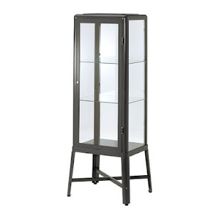
FABRIKOR $179

HELMER $39.99

TARNO $49.99

HOVET $129